If you need any help setting up your website or learning about the options that are available, the below information should prove helpful.
A demo of the SR Website Theme can be seen at: SR Webite Theme Demo
- First Steps
- Fonts
- Customising Your Website
- Pages
- Menus
- Posts
- Images
- Blocks
- Gallery Images
- Widgets
- Advanced Page Editing
- SR Bootstrap Container
- SR Bootstrap Columns
- Utility Classes
- Back-Up Your Website
First Steps
The first things you need to do on your new website are:
- Change the admin email address to ensure important email notifications are sent directly to you. You can do this by logging into the admin section of your website at: https://www.yourwebsite.com/wp-admin and going to Settings > General, and look for the “Email address” box. The default email address is webmaster@secretred.com, but you need to update this to your email address.
Fonts
In addition to Google Fonts a selection of premium fonts are available to use with this theme. You can see the fonts that are available here: Fonts.
You can use these fonts in the Customiser such as for the Site Title or Headings by selecting the font from the drop down list in customiser.
You can also use these fonts within some of the blocks in the page editor. Specific blocks created by me are prefixed SR, for example SR Quote or SR Heading, within these blocks if you see the box for Font Family you can enter one of the font family names from the font list to change that specific items font. In other blocks you can also use the CSS Class name in the “Additional CSS Class” box to change the font.
Google Fonts is also included so you can select fonts by Google. If you select a specific Google font, it will override the SR Fonts, so be sure to set Google fonts to Default if you want to use SR Fonts.
Customising Your Website
There are several things you can customise with this website, such as the colours, fonts, uploading your own custom logo, the look of the Header and Footer and much more. To start customising your website log into the admin section, on the left hand sidebar look for Appearance > Customise. This will take you to the Customiser with all the options for changing the appearance of the website.
Appearance > Customise > Theme Styling
- Global Options
- This is where you can find the font size and colour, site accent colour, site background colour and background image settings. Adjusting these setting will effect the whole website.
- Disclaimer Page
- This is where you can change the settings for the disclaimer page.
- Header – Default
- The Header is the top part of the website that contains the site title, logo and navigation bar. You can change the colour options for the default header here.
- Header – Floating
- You can change page templates for each page on your website, and by doing so will change how they appear (see the Pages section below). Page templates with Floating Header in the title are generally pages with a large image/video at the top of the page with the header floating over the top of the image/video. You can change the look of the Header on these pages here.
- Header – Sticky
- In the Theme Functions section you can convert floating header pages to sticky header pages, which means when you scroll down the page, the header will stick at the top of the screen. You can change the look of the Header on these pages here.
- Site Title
- Customise the Site Title font with one of the fonts available with this theme, or use one of the Google Fonts.
- Site Logo
- You can also upload your own custom logo which will replace the Site Title.
- Site Description
- Add a site description which appears below the Site Title/Logo. You can enter html in this box to highlight specific words for example:
Elite <span class="accent-colour">London</span> Modelwill create: Elite London Model
- Add a site description which appears below the Site Title/Logo. You can enter html in this box to highlight specific words for example:
- Navigation
- The main navigation bar can be customised by changing the colour, and spacing between the letters & menu items, and by adding a background image to the menu for small screens.
- Content
- The content section is where your page content and blog posts appear. You can change the font for all the headings, and colours for all the headings and content text.
- Sidebar
- You can change the font for all the headings, and colours for all the headings and sidebar content text. The sidebar is not activated by default, but can be activated by going to SR Theme Functions > Site Layout or activating it individually on each page. To add or remove widgets to the sidebar go to Appearance > Widgets.
- Footer
- You can change the font for all the headings, and colours for all the headings and footer content text. Also you can add a background image and/or background colour.
- Buttons & Forms
- Buttons and forms can also be customised here.
Appearance > Customise > Theme Functions
- Blog List & Post Pages
- The blog/post pages are seperate to regular pages, you can customise how these appear here.
- Sitewide Notice
- You can activate the Sitewide Notice here, which appears at the very top of the website. Enter your notice and change the colours.
- Sticky Header
- Turn on the Sticky Header, this enables the Header to stick to the top of the screen when scrolling down the page. Only available on Hero pages where the Header is already floating.
- Page Titles
- You can turn off the default page titles for all pages here, this enables you to have more control over the layout of your pages if necessary.
- Scroll to Top
- You can turn on/off the scroll to top button here.
- One Page Menu
- Use only if you want a one page website, this activates the menu close on click, so it doesn’t stay open when linking to content on the same page. Not necessary when using the website as a traditional website with multiple pages.
- Social Links Header
- Enter your social links to appear in the Header.
- Social Links Footer
- Enter your social links to appear in the Footer.
- Banner Ads
- Enter all your banner ads here. They appear at the very bottom of whichever page is selected as the Homepage.
- Copyright Details
- Enter your copyright notice here.
- Google Analytics
- If you have a Google Analytics account you can enter the Tracking ID here and turn on/off Google tracking. You will be able to then see the analytics directly in your Google account.
- Site Layout
- The default site layout is Boxed with One Column, this means the page has a maximum width of 1200px and there are no sidebars. This can be overridden on individual pages if you need to have the page at full screen width (when using Parallax or other features that look best when they are full screen width).
Pages
Pages are static, they are used to add your main content. To add a new page click the Add New button at the top of the Pages section, give it a name and add some content. When you have finished editing the page click the Publish button to publish it. To edit a current page, go to the Pages section on the left menu and click the page you would like to edit. At the top left of the page you would like to edit there is a circle with a + in the middle, clicking this will bring up all the Blocks that are available to add to the page. You can rearrange blocks on the page by hovering over a particular block and either dragging it to the new place using the 6 dots on the left of the block or clicking the up/down arrows.
On the right side of the page you are editing is the page menu with all the particular options for displaying that page. In the Page Summery box is where you will find all the different page templates that are available. Changing the page template will mean the page displays differently on the front of the website. For example, the Hero templates all have a featured image at the top of the page, which you can select by clicking the Featured Image box. For examples of how each page template looks you can go to: https://www.secretred.com/demo/page-layouts/
Menus
A page will only be visible on the front of the website if someone can find it, so we need to add it to a menu so people know it’s there and can visit that page. To do this go to Appearance > Menus. There are 3 menus available in this theme, the Main Menu is the menu at the top of the website and your main navigation. The Footer Menu is displayed in the Footer and the Keyword Landing Pages menu is displayed at the bottom of the website on the Homepage only.
To add a page to a specific menu, select that specific menu in the drop down box at the top of the Menu section. You will see the current items added to that menu, you can drag the items to rearrange them, you can edit a menu item by clicking the down arrow on that item, or delete it. To add a new item to the menu you can select it in the “Add menu items” box and click the Add to Menu button, then drag the menu item to the correct place in the menu. Don’t forget to save the menu or your changes won’t be saved. To make a sub-menu just drag an item so it is nested under the menu item above it. You can add any pages, posts, custom links etc to a menu.
Posts
Posts are dynamic, they change position based on the date they were created and are displayed in the Blog section on the front of your website. You can create and edit Posts the same as Pages, but they are in the Posts section.
Images
To add images to your website go to the Media section and click Add New. When adding images to your website it is important that you do not add images that are too large, as large images take a long time to download and create a bad viewing experience for your clients, it is also important that your images are not too small either, as they will look pixelated on large screens and this also creates a bad viewing experience. The largest an image should be when uploading is 2000px height for portrait orientation images and 2500px width for landscape orientation images. This in general creates an image that is large enough to be viewed in high quality on Retina screens but not too large in size that it takes too long to download, thus optimising the images for speed and quality. This theme will automatically adjust the image when uploading to optimise it for website viewing, creating multiple images sizes which can then be inserted into a page.
When adding images it’s important to add Alternative Text for each image that is uploaded, this is required for good SEO as Google loves text. To add alternative text, click the required image in the Media library which opens the image Attachment Details. The first box on the right should be the Alternative Text field, where you can enter your Alt Text.
It is also possible to resize or crop images in the Media Library. To do this click the image you wish to edit which opens the Attachment Details, under the image click the Edit Image button. You can then scale the image, crop of the image, rotate the image or flip the image. Of course it’s always best to upload the images in the correct size initially.
Blocks
Blocks are literally the building blocks for the website. Every item you want to add to a page or post is a Block, an image block, a paragraph block, a slideshow block, a heading block. To add blocks you can either simply start typing in the page content area which will generate a paragraph block, or you can select a specific block to add by clicking the small blue square with a plus sign (Add Block), you can then select any of the available blocks to insert into the page/post.
Each block comes with it’s own settings which can be changed in the right sidebar by selecting Block instead of Page (which is the page settings).
Gallery Images
This theme comes with several gallery styles, including custom slideshows. To add or change a gallery go to FooGallery > Galleries where you will see the current galleries. Click the Add Gallery button to create a new gallery or click a current gallery to edit that one. To add images to a gallery click the large Add Media tile which opens the Media Library and select the images to add. To delete images from a gallery hover over the image you wish to delete and click the X, this only removes an image from the gallery but does not delete it from the Media Library.
To select the type of gallery click the drop down menu under the images called Gallery Settings, this will enable you to select how the gallery will be displayed. You can then change the specific settings for the selected gallery style.
To add a gallery to a specific page or post, you need to either copy the Gallery Shortcode and paste it into the page/post where you wish the gallery to be shown or insert the gallery using the blocks option and search for FooGallery.
Widgets
This theme has a selection of extra widget areas built into it that allow the placement of Widgets, that will appear on all pages/posts of the website or a specific place as determined by a specific widget area.
To add extra items to the Footer for example, you can go to Appearance > Widgets, and then add a specific widget such as a Text widget to the “Footer – 3 Columns” widget area. You could also create a new menu in the Menu section and add that menu to the “Footer – 3 Columns” widget area.
Optional Advanced Page Editing
The below options are available as more advanced page editing, you do not need to use these, but if you would like to create responsive layouts with rich viewing experiences for your viewers to enjoy this is where you would start.
SR Bootstrap Container
When you start writing your page content, this is when you can utilise the SR Bootstrap Container, which is the building block for creating different layouts. It’s created with Bootstrap 4.3 which is the latest instalment of the world famous toolkit for building responsive mobile friendly websites. It works by creating a container that whatever is inside it displays either in columns or rows depending on the settings you select. For example, if you select the Layout as Vertical, everything inside the container will be in one long column, if you select Layout as Horizontal, everything inside the container will be sit next to each other on the same row.
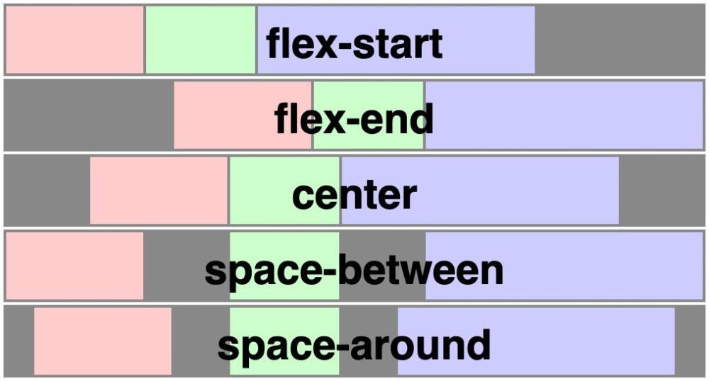
Align Items Horizontally option uses flex justify-content and allows you to change if items are positioned at the:
- Start (left),
- End (right),
- Center
- Between (with an equal amount of space between the items)
- Around (with an equal amount of space all around the items).
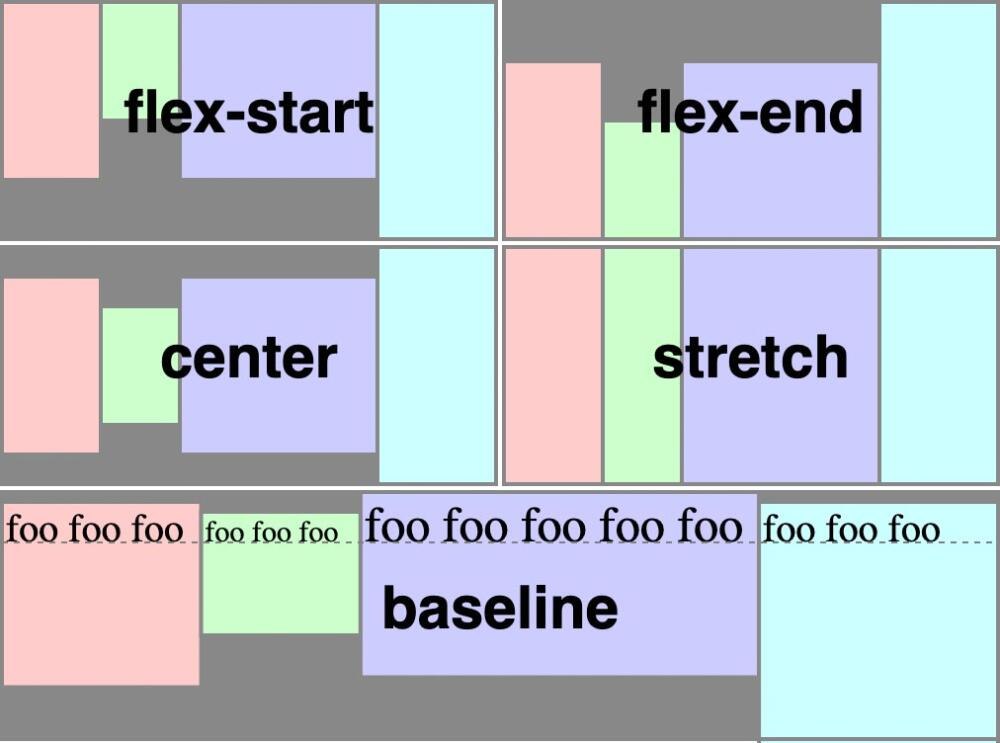
Align Items Vertically option uses flex align-items and allows you to change if the items are positioned at the:
- Start (top)
- End (bottom)
- Center
- Baseline
- Stretch
To create multiple columns of content you would need to select Layout as Horizontal and then add 2 or more SR Bootstrap Columns into the Container.
SR Bootstrap Columns
When you add SR Bootstrap Columns inside the SR Bootstrap Container you can start to create layouts that are responsive to different screen sizes. The SR Bootstrap Columns have breakpoints where they change width at different screen sizes; extra small screens (mobile phones, the default screen size), small screens (larger phones), medium screens (tablets), large screens (laptops) and extra large screens (large laptops & desktop computers) so you can change how the layout looks on different screen sizes. The container width is measured in multiples of 12, i.e. 12 is 100% width, 6 is 50% width, 4 is 33.3% etc.
When you add two columns inside the container you can select the width of each column in multiples of 12. If the first column has a width of 6 and the second column has a width of 6, both columns will each be 50% of the container width. If the first column has a width of 8 and the second column has a width of 4, then the first column will be 66.6% of the container width and the second columns will be 33.3% of the container width, with both being on the same row. The more columns you add, the more layout variations you can make. If the combined width of the columns equals more than 12 they will form a second row, or third row as the case may be.
Change your browser size to see how the below columns change layout depending on the browser window size (screen size).
sm-6
md-6
lg-6
xl-6
sm-6
md-6
lg-6
xl-6
sm-12
md-8
lg-8
xl-8
sm-6
md-4
lg-4
xl-4
sm-6
md-4
lg-4
xl-4
sm-4
md-4
lg-4
xl-4
sm-4
md-4
lg-4
xl-4
Utility Classes
These are optional, you don’t have to use them.
Sometimes you may want to control the layout or position of particular items on a page that can’t be done with the built in settings, so for this I have created certain utility classes that can be added to blocks to enable greater control over the look and feel of your pages.
Margins
To create space between blocks/items on your page you can add margins. Add the below CSS classes to the Additional CSS Class box for a specific block to add margins.
The available margin classes are:
m-10 for example will add a 10px margin on every side of the item, on every screen size.
m-20
m-30
m-40
m-50
m-60
m-70
m-80
m-90
m-100
mt-10 will add a margin of 10px to the top of the item.
mr-10 will add a margin of 10px to the right side of the item.
mb-10 will add a margin of 10px to the bottom of the item.
ml-10 will add a margin of 10px to the left side of the item.
You can also target specific screen sizes so different screen sizes will have different margins, for example:
m-sm-10 will add a margin of 10px to all sides of the item on small screens and above.
m-md-10 will add a margin of 10px to all sides of the item on medium screens and above.
ml-lg-10 will add a margin of 10px to the left side of the item on large screens and above.
mr-xl-10 will add a margin of 10px to the right side of the item on extra large screens and above.
etc…
Padding
The available padding classes are:
p-10 for example will add a 10px padding on every side of the item, on every screen size.
p-20
p-30
p-40
p-50
p-60
p-70
p-80
p-90
p-100
pt-10 will add a padding of 10px to the top of the item.
pr-10 will add a padding of 10px to the right side of the item.
pb-10 will add a padding of 10px to the bottom of the item.
pl-10 will add a padding of 10px to the left side of the item.
You can also target specific screen sizes so different screen sizes will have different padding, for example:
p-sm-10 will add a padding of 10px on all sides of the item on small screens and above.
p-md-10 will add a padding of 10px to all sides of the item on medium screens and above.
pl-lg-10 will add a padding of 10px to the left side of the item on large screens and above.
pr-xl-10 will add a padding of 10px to the right side of the item on extra large screens and above.
etc…
Max Width
Sometimes you may want to limit the width of an item, specifically images, so they don’t take up too much space or too little space when added to content in the page. For this you can define the maximum width of the image in % of its parent container by adding the below classes:
mw-10 for example will limit the item to 10% width of its parent container, on every screen size.
mw-20
mw-25
mw-30
mw-33
mw-40
mw-50
mw-60
mw-66
mw-70
mw-75
mw-80
mw-90
mw-100
mw-sm-10 will limit the item to 10% width of its parent container, on small screens and above.
mw-md-10 will limit the item to 10% width of its parent container, on medium screens and above.
mw-lg-10 will limit the item to 10% width of its parent container, on large screens and above.
mw-xl-10 will limit the item to 10% width of its parent container, on extra large screens and above.
etc…
Example:
The below image is the SR Image block and has the following margin and max width classes added: mt-20 mt-md-50 mw-100 mw-sm-50 mw-lg-33, resize the browser window to see how the image width and margin changes size.
Back-Up Your Website
If you have not opted for the support package which includes automated weekly backups of your website, you can manually save a backup of your website at any time by going to: Tools > Export. In the Export section you can export any part of your website. You can then restore your website if there are any problems at a later date by going to: Tools > Import.